Style your site for mobile with Drupal 5 and CSS
The following article documents how I went about creating a mobile version of the Art Institute of Chicago’s Collections website in Drupal 5 using CSS and Javascript. I presented this work at the March 2012 Chicago Drupal Meetup Group. Here are my slides from the presentation:
At the Art Institute of Chicago, our museum website is run as two separate pieces. Collections—information on ~50,000 of the 150,000 artworks in our galleries and archives—runs on Drupal 5 and was initially developed by Palantir in 2008. Everything else runs on Serena Collage, a now-out-of-business CMS, and is currently being redesigned in Drupal 7 (phew!). I work mostly with our Drupal 5 Collections website.

More of our users are visiting our site on mobile devices. 7.75% of our visitors in February were on mobile devices, up from 3.25% the previous year. These aren’t staggering numbers today, but are inline with global trends. As mobile trends grow, we need to make the experience of these visitors more accessible. Viewing our current site on a mobile device is a little bewildering, with teeny-tiny text and links that you have to zoom in so far to use that they’re essentially unusable.
Our regular site is being redesigned with mobile in mind. With no immediate plans to upgrade our Collections site on the horizon, we needed to think about how we can work-with-what-we-have to satisfy our mobile users today. This led to us taking our current design and laying it out for mobile users—literally hiding content that’s less essential and making the rest bigger and more streamlined. We made an effort not to over-complicate our work so we could get a mobile site launched in a short amount of time (about 3 days of work).
Mobile design
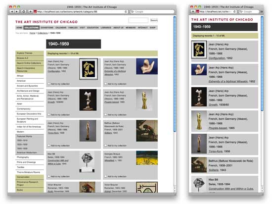
The layout of the mobile site is simpler. We display all the pages in a single column to allow each feature to be as large as possible and provide a simpler flow of information. We silo the content to just our artwork objects. Links to other sections of our website and other related content are removed for now, and will be rethought about post-launch. With the small amount of screen real estate, we put content first. This means navigational items and related links go to the bottom of the page. This is not ideal, and there are definitely sexier ways to address navigation, but in the interest of a short turnaround, we’ll address that post-launch with a thoughtful approach to our users’ needs.
Technical strategy
In the same effort to not over-complicate a new version of our site, we offer the mobile site using the same URLs as our desktop site (www., not m.). All server-generated code for both sites are exactly the same, and we use CSS and JavaScript to change the look of pages depending on the size of your device. There are a number of pros and cons to this approach.
Pros:
- Since the server-generated code is the same for both pages, we still take advantage of our page caching, keeping with our efforts to keep PHP and MySQL load on our server low.
- External links to our content (via blogs, social media, etc.) always display relevantly to your device. If someone tweets an artwork and you view the link from your desktop or phone, you always see the most usable layout without us worrying about forwarding users to different subdomains or checking headers on each page load.
- There is no additional work for our content creators and no change to our content management workflow.
- Our implementation does not use dynamically generated CSS or Javascript, so we can still take advantage of script aggregation.
Cons:
- Mobile HTML includes a lot of content that’s not displayed, causing users to download more than they see. This will make our simple pages load slower on mobile devices than necessary.
- Since we’re not changing the HTML markup, we can’t be super creative with our mobile layout. For our immediate needs, this is fine for us. But if we ever want to get a little fancier with our mobile site, this will not be the most flexible implementation.
Because the mobile world is changing quickly, we release small, quick iterations of our mobile site with the intention of evolving it as we go. With feedback from users we’ll be able to target development work in thoughtful chunks as we move forward.
We also allow users to switch between the desktop and mobile site, so they can still get to content that has been omitted from the mobile site. We follow the assumption that mobile users will want to get to data anyway they can, and will even deal with a desktop site on a small screen if they really want to get a piece of information.
Now let’s take a look at how I implemented our mobile site.
Layout
We primarily use body classes to swap the page layout between mobile and desktop:
<body class="mobile">
All the mobile CSS will be dependant on this body class. This gives us a mechanism to specify a layout that’s not dependent on your viewing device, so we can view the desktop site on mobile and vice versa. There are a number of ways to add body classes in Drupal 5, we create a $vars[‘body_classes’] variable in our theme’s phptemplate_preprocess_page() function that’s a string of all the body classes that should be used, then output those classes in our page.tpl.php.
On each page, we include an addition CSS for the new layout by calling drupal_add_css() in our theme’s phptemplate_preprocess_page() function. This CSS file starts with a wrapper for all its declarations:
@media screen and (max-device-width: 540px) {
This media query limits the CSS in this file to devices whose maximum width is 540 pixels. Device widths are far from standard, so we choose 540 to include iPhone-sized devices (480px) and some larger Android devices. If we want the option to view the mobile site on a desktop, which might be helpful for users with vision impairments, we can leave this wrapper out.
Each CSS declaration uses the body class defined in the HTML markup:
body.mobile *
{
float: none;
}

body.mobile #navbar
{
display: none;
}

body.mobile .thumb
{
float: left;
padding: 0;
height: 100%;
width: 23.33%;
}
This CSS file is where all the design of the mobile site happens. We don’t display elements we want to hide using display: none, and reformat elements to look bigger and cleaner on a smaller screen. Because we’re working with screens of varying widths, we don’t use pixels to size elements. Instead we use percentages, even if they seem absurdly precise, and ems.
So that’s one static CSS file that gets loaded on every page, and gets aggregated with our other CSS for performance sake. Our layout is complete, and it displays on devices with smaller screens.
Toggle between desktop and mobile
At the bottom of each page we include some markup for the user to toggle between the desktop and mobile site:
<p id="toggle-mobile-off">
[ <a href="#" class="toggle-mobile">View Full Site</a> ]
</p>

<p id="toggle-mobile-on">
[ <a href="#" class="toggle-mobile">View Mobile Site</a> ]
</p>
In our Drupal theme CSS, we hide these elements using both visibility and hidden. This prevents Javascript show() methods from being able to display these elements on desktop sites:
#toggle-mobile-on,
#toggle-mobile-off
{
visibility: hidden;
display: none;
}
In our mobile.css, we change the visibility option to allow Javascript show() methods on our mobile site to actually work. This is the one declaration we don’t include the body.mobile prefix, because we want this to be the case soley based on device width:
#toggle-mobile-on,
#toggle-mobile-off
{
visibility: visible;
}
Now for the desktop site, Javascript cannot control whether the toggle options display, they are always hidden. For smaller devices, Javascript can control whether these options display.
On the initial page load with this CSS both toggle options are still hidden. How do we decide which one to show? Well, that depends on what we know about the user’s preference. By default we want to display the “View desktop site” link. But if a user has requested to view the desktop version of the site, we want all subsequent pages to pull up as the desktop version to make their experience consistent. So we’ll display the “View mobile site” link until the user requests otherwise. We’ll be using some standard jQuery, along with the jQuery cookie plugin.
First we pull the cookie that we set for the user preference:
var mobcookie = $.cookie('mobcookie');
By default, this cookie doesn’t exists and won’t for most users. But in case it does, we’ll check if it’s set to a preference for the desktop site. If it is, we remove the mobile body class and add a non-mobile placeholder, and display the ‘View mobile site’ link:
if (mobcookie == 'moboff') {
$('body').removeClass("mobile");
$('body').addClass("not-mobile");
$('#toggle-mobile-on').show();
}
Otherwise, leave the defaults and show the ‘View desktop site’ link:
else {
$('#toggle-mobile-off').show();
}
Now let’s add a listener for the toggle links. If either of them are clicked, we can run the same code and just toggle each element, since we’ve already set up a good baseline for whether each is shown. We call the preventDefault() method to stop the <a>link for being followed:
$(".toggle-mobile").click(function (e) {
e.preventDefault();
$('body').toggleClass("mobile");
$('body').toggleClass("not-mobile");
$('#toggle-mobile-on').toggle();
$('#toggle-mobile-off').toggle();
Now we set the cookie. By setting it here, we’re only setting it if the user diverges from the default mobile site.
if ($('body').is('.mobile')) {
$.cookie('mobcookie', 'mobon', {path: '/aic/collections/'});
} else {
$.cookie('mobcookie', 'moboff', {path: '/aic/collections/'});
}
And then scroll the user to the top of the page after they toggle.
$('html, body').animate({ scrollTop: 0 }, 0);
});
Here’s what all that code looks like together:
$(document).ready(function() {
var mobcookie = $.cookie('mobcookie');
if (mobcookie == 'moboff') {
$('body').removeClass("mobile");
$('body').addClass("not-mobile");
$('#toggle-mobile-on').show();
}
else {
$('#toggle-mobile-off').show();
}

$(".toggle-mobile").click(function (e) {
e.preventDefault();
$('body').toggleClass("mobile");
$('body').toggleClass("not-mobile");
$('#toggle-mobile-on').toggle();
$('#toggle-mobile-off').toggle();
if ($('body').is('.mobile')) {
$.cookie('mobcookie', 'mobon', {path: '/aic/collections/'});
} else {
$.cookie('mobcookie', 'moboff', {path: '/aic/collections/'});
}
$('html, body').animate({ scrollTop: 0 }, 0);
});
});
The functioning of the toggle between the two versions of the site happens in the browser using only CSS to display the pages differently. Though one of the cons to this method is that mobile devices are loading a lot more markup than they need to, a resulting benefit is that this swapping happens super-quick, since all the necessary elements are already loaded in the user’s browser.
That’s it! As developers, we’re constantly working to keep up with a set of tools that are constantly changing. With this work I’m taking a few small steps to make our users’ experience more usable, in a way that can be easily iterated over as we learn more about our users needs.